Superellipses?
No, of course not.
Mark Edwards and Rene Ritchie think that iOS 7 icons are shaped as superellipses. Apparently, when you plot the function for a superellipse in Grapher and tweak the values, you get a shape that looks a lot like the iOS 7 icon’s shape. The problem with this methodology is that superellipses do tend to look a lot like rounded rects, so it’s hard to say for sure without zooming in.
The bounding rect of any iOS 7 icon is a square (and that’s true of the app icon template of any respectable mobile OS), so we need to consider only supercircles as candidates. (A supercircle is just a superellipse whose bounding rect is a square.)
We are only concerned with the shape of the supercircle, so let’s forget about position and size. Let’s consider only supercircles centered at the origin and having a unit radius (i.e. width is 2 units). The general equation for such supercircles is:

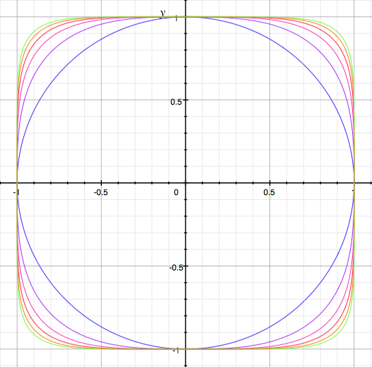
At n=2, it’s just a plain old circle. As n increases, the shape
becomes more and more like a square (hence the name squircle at n=4).

At higher values of n, it looks remarkably like a rounded rect. I
suspect that is the reason for the confusion about iOS 7 icons being
shaped as superellipses.
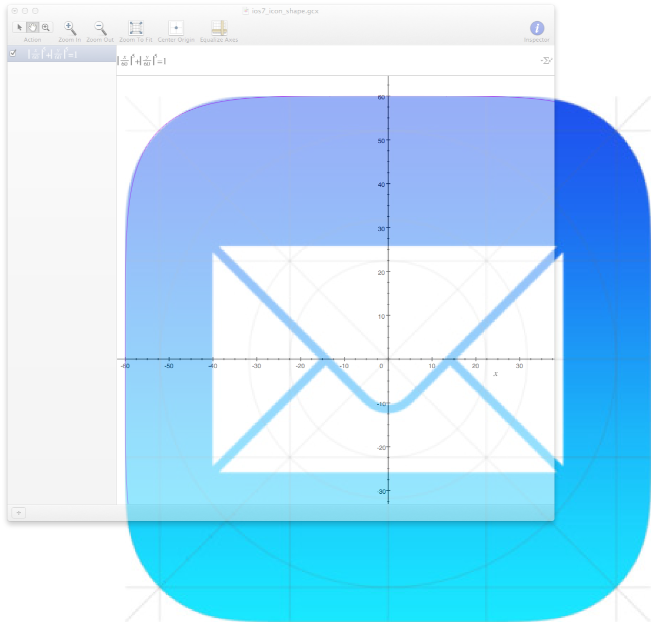
If we look at the iOS 7 Mail icon close enough and compare it with a plot of the superellipse formula that Mark Edwards came up with, we see that it doesn’t quite match up exactly.

In fact, it seems to match up better with a rounded rectangle, but one with a greater rounding radius than an iOS 6 icon.
(Update 22/Jun/2013: Yes, it matches a little better with a roundrect, but it still doesn’t match exactly.)

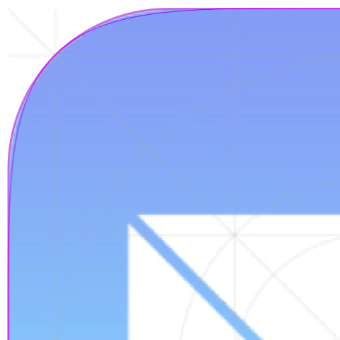
Here’s a close-up of both the rounded rect and the supercircle overlaid on the icon. That’s how close the squircle is to a rounded rect.

So, it looks like it’s still a rounded rect in iOS 7
(See update below). Apple is not going
to give up on it’s iconic icon shape so soon. And anyway, it’s very
unlikely that Apple would take to a shape that is really owned by the
Nokia brand.
Update 22/Jun/2013: Rene Ritchie pointed me to the WWDC session that made it pretty clear that it was not a round rect. Nevertheless, it doesn’t look like a superellipse to me still. The hunt is on.